
sooooooooo recently, i found myself scribbling a new direction for an old group of characters. . . it was a comic strip/cartoon stories called Ham and Eggs.
It stars a happy-go-lucky-glass-is-overflowing Pig named Hamilton and his half brother, a realist-glass-is-half-empty-and-someone-better-not-spit-in-it Chicken named Eggbert. Two characters, with two totally different perspectives, and all of their friends that they live near in the Neckutha Woods. :)
anyway, i'd done some images and thought about doing something with them, but the designs were never quite there for me. i liked the characters that were evolving and their personalities, but the designs didn't make me laugh right off the bat. i wanted them to be funny looking and make you smile just from looking at them, and then you could enjoy the stories even more.
well, here we are a few years later, and i've think i've found my cast. i love where they are and what they look like now! :) and the rest of the gang is coming out really fun too.
so here's the old Ham and Eggs . . .
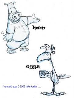
i like the old ones just fine, but again, they didn't have the immediate response i wanted. they didn't feel funny and endearing to me, so i couldn't quite move forward with anything with them.
now, moving forward, here's the new and improved . . .
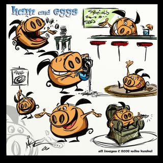
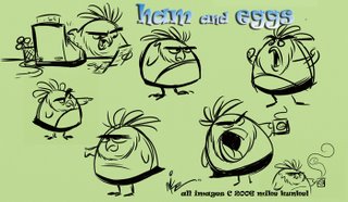
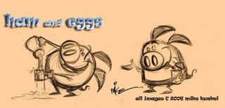
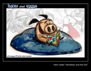
now, to me, these feel much more like the personalities and the imagery i've been looking for. i'll post some of the other characters soon too. it's fun when you let something cook for a while and then when you come back to it, something clicks. and this feels like it's clicking. :)
anyway, thanks for letting me babble . . . i hope you enjoy these too. . .i know i am. :)
take care and all the best,
m . . .

17 comments:
SUPER cute!
i giggled as soon as I saw the new & improved ham 'n eggs!
can't wait to see more mikey ;)
WOOAAAHH¡¡ awesome, i love it.
Cool character design
mike, too cool man. the old designs were great but these are awesome. can't wait to see more.
cheers,
Andrew
mike! These are AWESOME! Love the new direction! Inspiring!
-R.
Sorry... don't like 'em =:(
I mean, as new characters, they're pretty cool - actiony, rhythm formed characters that can be in a strip or a short without any dialogue, but I think both characters have lost some of their... "character" as a result.
Ham goes from being an optimistic, semi-wise narrator to Stimpy the village idiot. Meanwhile, Eggs is no longer just pessimistic (with the reader feeling that deep down he really *does* care) and is now angry as well...
Of course, I'm characterising them from the few sketches you have here, but then, you mentioned that you like the feel of these ones better, and that's what I feel when I look at these guys.
Will be interesting to see what you do with them. I reckon less dialogue than the original strip, but then, do you end up with characters that grow on the reader or merely a weekly gag-joke?
Yuor characters are awesome man, and these are really expressive. I love your style.
Oooooo ooooo oooo
Let me critique, since I have no
right to.
I REALLY like the new Ham
make-over. But I'm not convinced
about Eggs. I think it'd be better
to have a thin/tall character next
to Ham's honey-baked character.
Although with Eggs' current shape,
I can see a gag of him coming out
of his shell (EXACTLY the same
shape of him !!!). And Ham being
imagined as a hamhock (which is his
approximate shape). But I think
the Stan & Ollie / Oscar & Felix
type of size relationship would
work better.
Just my nickel's worth,
John H.
Really funny! I definately like the redesigns.
hey guys, thanks for the comments.
as for their personalities changing because of the new designs . . . nope, they haven't changed. Mike's Mum, you came pretty close to whoe they were and still are. the new designs simply trying to give them a little more immediate charm so that when you read them, you'll like them even more. :)
eggs, still cares deep down. ;) and ham is forever the optimist. and,there won't be any less dialogue. in fact, the stories have grown with them and their cast of characters.
again, this is stillllllllll the beginning, so they are likely to evolve a little bit more. :)
anywaaaaaaaaaaaaay, thanks for checking them out.
more to come soon.
take care and all the best,
m . . .
nooooo!!!kunkle's blogg???nooo!what i have found?! hero bear is very funny...like this...pig(?!!!)sorry the bad english!visite my blog..I'm waiting your opinion!
I Love it!
Ahhh, awesome stuff! I've got my Mike Kunkel fix set for awhile. I'm sure you'll work out any of these "problems" people are talking about ;) I think it's real good to revisit old stuff. It's great that you're not settling. They're looking pretty amazing.
Holy moly dude, these look awesome, can't wait to see more!!!
mike...,
You've got to put a Dr. Seuss
gag in there. If they're on a
farm, then the farmer would be
Farmer Green. Otherwise their boss
could be Mr. Green. Then you'd
have "Green's Eggs and Ham"...
John H.
o.k.... I'd better stop.
ha ha! love the new designs! these characters just look so fun. i like how the eggbert design gives him the impression of wearing a wifebeater shirt too. :D
*rolls eyes at John H's comments*
Okay - so I'm a bit jealous I didn't think of it first...
*pouts*
The new Ham is an improvement to be sure, but I love the old Eggs better. He seems to have a pleasing grumpiness that is applealing. I love the shapes that make him up too. The new one is fun, but the old is a personal fav! Just casting my vote. Nice work all around!
Post a Comment